The Yin and the Yang. The Karmic Wheel. Good versus evil. Light and dark. Etc.
There’s supposed to be some kind of balance in the universe. For me, as a comic bum, it was the hope of more “ring” pages. The characters The Flash or The Mandarin—both had rings. The Flash had a crazy system of intense high-speed folding (soaked in mysterious chemicals, no less) that fit his entire costume into a “poison pill” ring. The Mandarin had alien-technology-based rings for each finger—each one could do things.
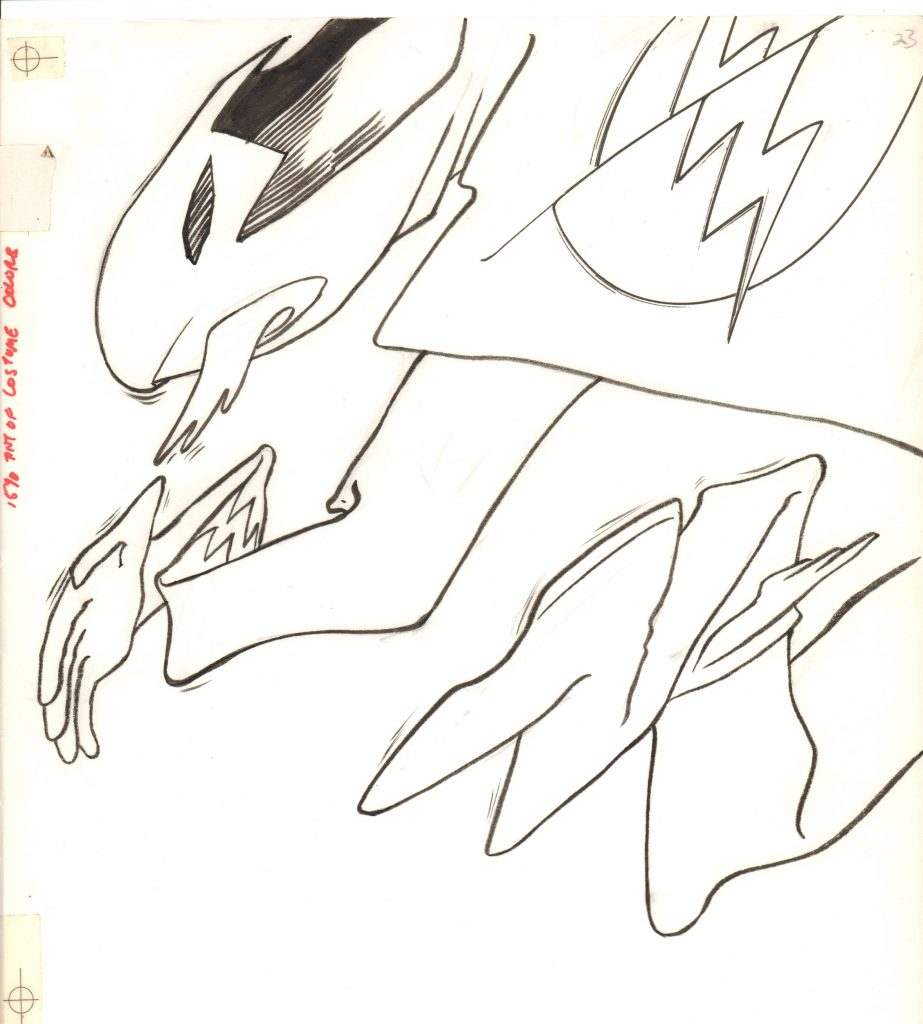
But they were simple… nice and simple. I grew up watching DC Comic’s Flash, then police forensic scientist, Barry Allen, pop his ring open and enjoyed seeing his costume fly out. I loved that little scrunchy version going outward from a simple ring. Presumably, Mr. Allen would then take off his street clothes and put on his now-full-size – and dry — costume at super speed. Y’know, he’s in public view. What does he do with his street clothes? As of late, The Flash’s speed has achieved a high silliness factor, I see no reason he can’t run home and change out of his clothes into his costume, then run back before anyone is the wiser. But I digress.
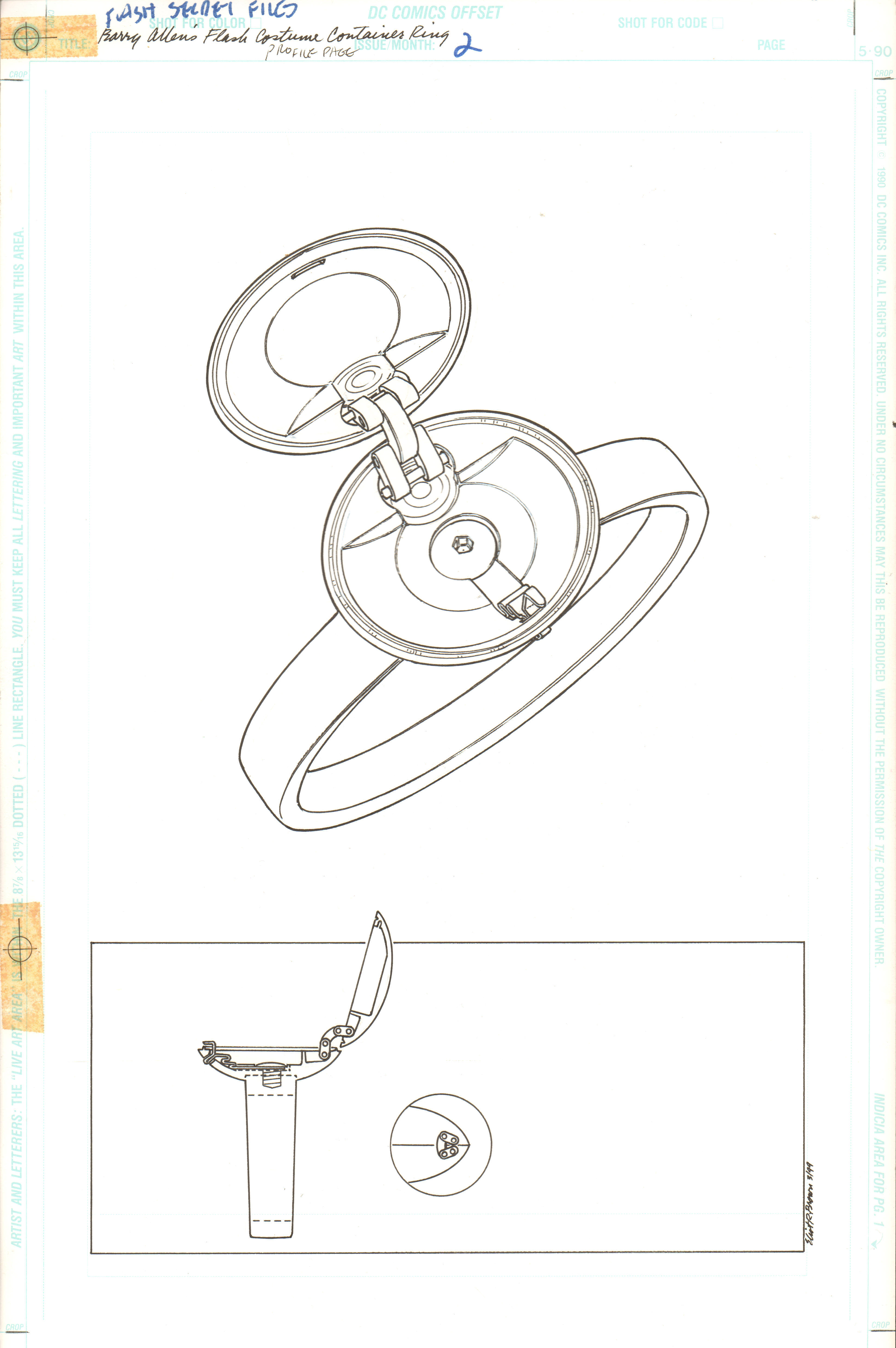
Okay, here’s my Flash ring page. Talk about “Stockholm Syndrome” – here I was feeling so badly about getting a page rate for so little work—I actually did a surprint of the “unfolding” costume. Which was to be printed in a see-through red color. The Flash ring page probably took a long afternoon. Including sketches, coffee breaks, pencils and inks.
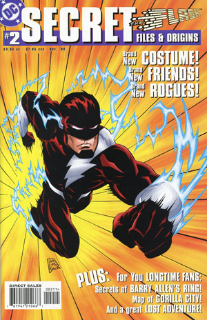
DC Production, bless their crooked T-squares, actually paid attention to this sad demonstration of attention-getting and worked their magic! Hey presto! Printed like a dream—see for yourself Flash Secret Files #2, Nov 1999
I may have been chuckling to myself as I went out and bought some super-huge isometric ellipse inking templates prior to my couple of hours’ worth of careful drafting. ‘Chuckling’ I say– I had finally outwitted those know-it-all editors! Ha Haaahhh!
But there was that nagging voice in the back of my head—the voice of my mom, actually. It whispered, yeah, but it looks all lonely… those few, sparse lines… maybe something else is needed… right? A-a-all that money for a few lines… who are you, John Byrne!? Ah! The suit… yes… that crazy scrunched up suit… yeah, baby; that’s the thing to do. A little more effort. Surely Stan—err—Jeanette would smile down on me from the Top Floor…
I should have held before me, images of the Avengers’ Quinjet or Mockingbird’s Battle Staves (which I pretty much designed to work) and relaxed.
Headquarters Pages
I would like to say that I “pulled out all the stops” because I found myself working for David Goyer. Yes, that David Goyer! I actually spoke to him! Did the screenplays for The Puppet Masters, The Crow City of Angels and even Nick Fury Agent of S.H.I.E.L.D. (a made-for-TV movie, the one with David Hasselhoff (which is surprisingly okay)) among others, wrote many a comic book and then he wound up with me.
I would like to say I was star-struck and hoping he would like my work—maybe get attached to one’a them thar “Hollywood” dream teams of design. So I went a little “overboard.”
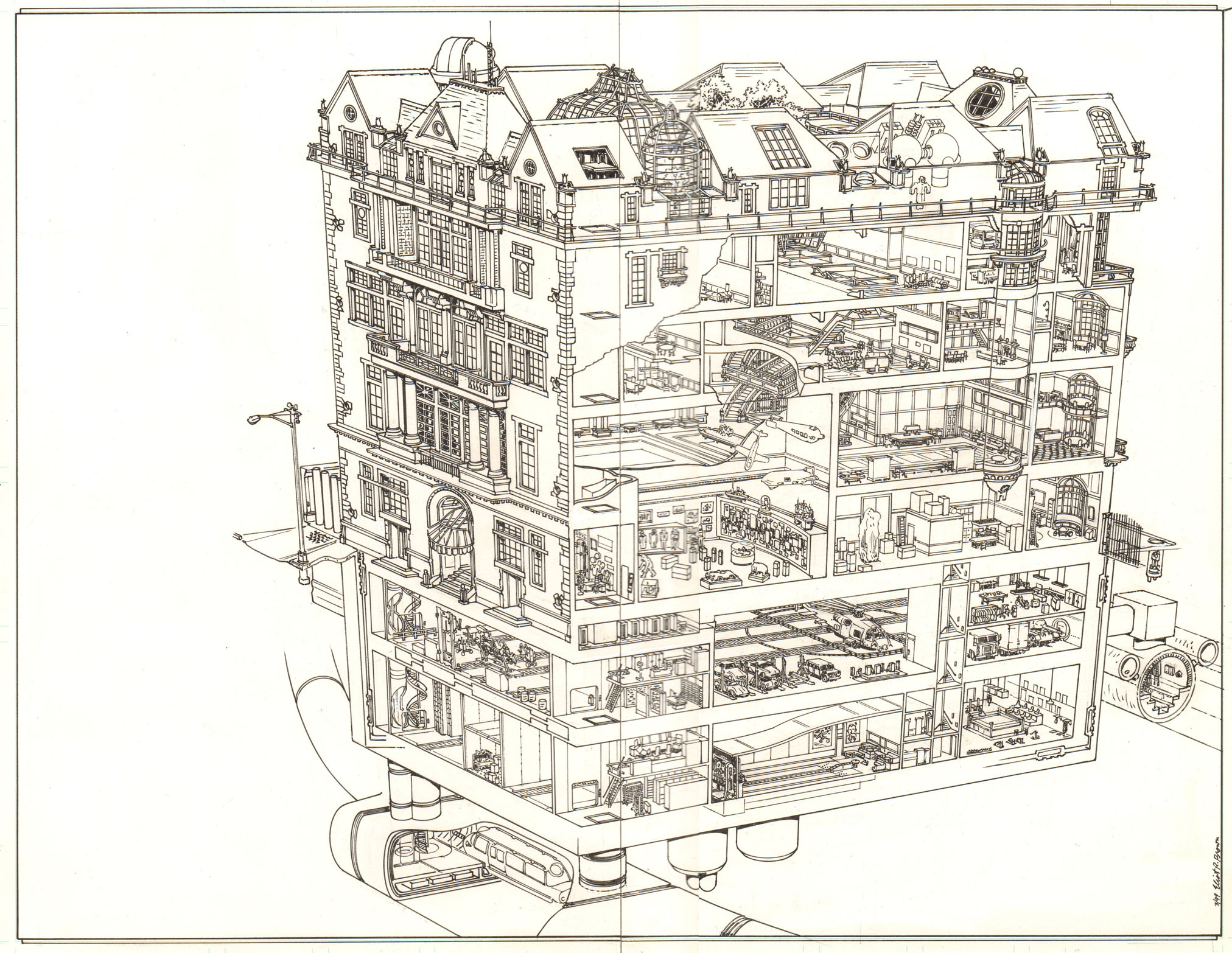
I would like to say that, but alas, I find that the job often “speaks” to me. It is not often that I get to design an entire HQ from the ground up. Mr. Goyer gave me free rein but I was also given a thatch of reference and had several conversations during which I took notes. This was to be the grand re-launch of the Justice Society of America!
The trouble with the JSA was that it was old, had a lotta lot of stories and side characters, places. Some stuff had to be swept under the carpet—or in my case, placed on the other side of the building! Mr. Goyer had plans to rejuvenate this old cast of characters and my hope was that the HQ would be that “JSA +1” character.
So the job “spoke” to me. It was saying things like, “Sure you could suggest a staircase, but the old club atmosphere demands you draw it all!” Or, “The bird guy needs an aviary and a place to launch from!” Or, “You call that a façade? More windows, coward!” Or, “You did see a place in the Gift Shop where you can hang models of their ships? Well, didn’t you!?” Or, “Hey, dummy, there has to be more than your usual security and freight elevator in this one! It’s a super-hero HQ!” And so on. I hardly ever answered back—that voice can be mean.
Mr. Goyer suggested that I follow the old “Avengers Mansion” concept put forth by Stan and Jack. The Mansion looks a hell of a lot like the The Frick Museum, located on Fifth Avenue and 70th Street and was presented in the books as a super-hero headquarters. Well, I thought it was ridiculous, but when you think on it—the audience likely to visit an art museum and one who buys comic books would never mix—okay! I’m a believer! (I did draw up the Avengers HQ for Marvel Universe—the best part was that the exterior was already designed for me.) Mr. Goyer wanted something that I found too outlandish: The Dakota. The legendary apartment building from the 1880s on Central Park West. I thought it was too well known. The Frick was well known only to midtown Manhattanites. But the Dakota! By then, the notoriety of John Lennon’s untimely murder at that place, had hardly died down.
I counter offered The Guggenheim Mansion.
Okay, I guess I did go overboard. A little. And Dave—I mean, Mr. Goyer — has not called in over 18 years and counting. The chances of future collaborations are looking rather wan.
The point of this essay is to demonstrate what an idiot I am. “Ring vs. HQ Pages” – what would the difference be? Aside from time spent at the drawing board?
Nothing. No difference at all—as far as page rate goes!
The “page rate” is how much one is paid per function per page. The result of occult proceedings, sacrificing of freelancers and such, in a Star Chamber-ish gathering of Priests and Subalterns that coughs up your page rate, among others’—but who cares about them? Considering that throughout my career, I did everything on a page—excepting lettering or type and coloring (except in fairly rare circumstances)—each one of my rates was set down on the rate list. I believe it was Jim Shooter who, in one of his fairest of fair acts, considered my “text” and “legends” plus placement to be worth a completely different rate. Thus was born the “Technical Writing Rate.” Only myself and Richard Bennett (mine was around Marvel Universe days, his was around the Guide to the X-Mansion) got one. We had our own long, skinny column that was maintained, blank, on every page of the rate list until you reached our names.
DC Comics had their own method of payment, similar in the breakdown of work but dissimilar in that they would lump it all together in one page rate. It is thus a little harder to figure out how much I was paid for which function (pencils/inks) but it ranged from $210 to $450 flat per page. The lower number was for some clearly “pencils and inks” only—no writing. I am profoundly ignorant when it comes to the minutiae of the DC Universe (I read Batman and Superman till I was 8—paying money for a comic book back then (roughly 1962) was not a “thing” – as I recall my weekly allowance was 25 cents). I was only too happy to let someone else write the copy. The higher number was their “kitchen sink” rate, as I understand it. This included unusual things like breakdowns and a “buy out” fee, whatever that is. Which I thought was awfully nice of them (I believe it was Paul Levitz, Editor in Chief at the time—I encourage all right-thinking comic readers to run out and buy his book: The Bronze Age of DC Comics (ISBN-10: 3836535793) or the honking, great massive tome 75 Years of DC Comics). Of note is that this time, I did write some text for the JSA HQ. Well, it was a building and I designed it so I thought I could. Upon re-reading– er, most of it– dismal stuff.
Merely drawing the page is just a part of tying this Gordian Knot. One has to design the building—and believe me, leaving out the plumbing or H/VAC saves only so much time—then design the page. At one point, I felt a vertical 2-pg spread might look better and spread the art out. In that idea, I had the floors slid out from one another so that you could see more. Then I slapped myself awake—why would I figure out a way to do double the work? I settled on the fabulous arrangement you see above.
Then I set up my perspective. I make perspective rails out of illustration board—these gadgets allow the head of a T-square to slide against an arc cut into a strip of board. The result is that the blade of the T-square will then act like it is attached to a distant vanishing point. I remember one of the vanishing points was 9-feet away. This allows one to pencil and ink along perspective lines with confidence. No guessing at in-between lines.
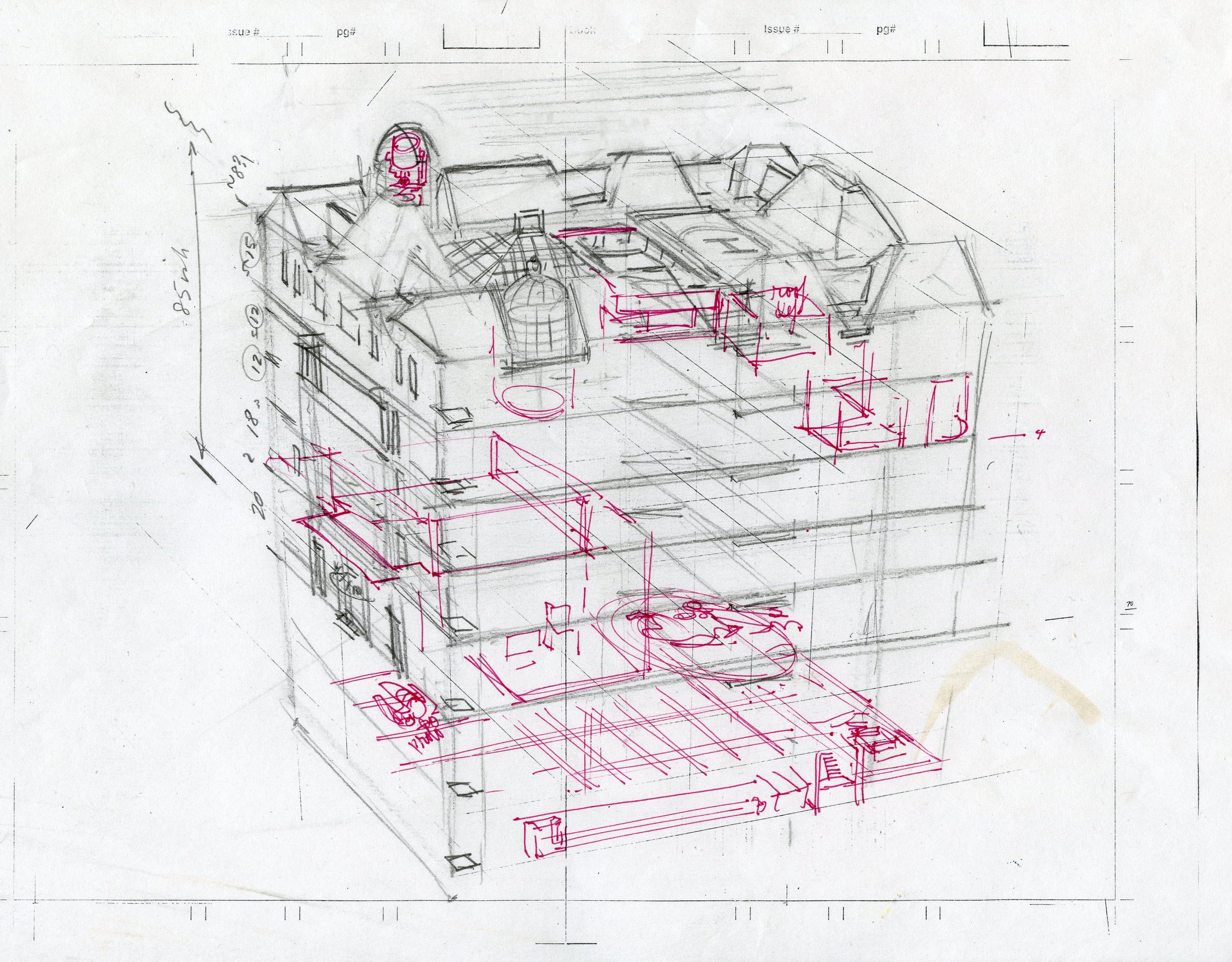
At the point shown above, I had come as close as I could to figuring out what parts to leave open so as to see inside. Some details deserved to have more shown—some, I could just show a small part and tell that room’s story. Elevators, escape tubes, freight and vehicle movers—all had to traverse the height of the building and of course, my favorite: connections to sewers and the NYC subway system! In fact, you can see above that I had not figured that out. But I would!
Also you can see that I flattened the angle of the roof so as to show less of all the details.
That down-looking angle would also make things tougher for me to draw on the lower floors. Once again, looking ahead in order to save (some) drawing time. Even, hopefully, be able to show things with less distortion—more like looking into a dollhouse rather than an extreme view point.
Now to be completely fair, the JSA job had a third page, composed of fairly empty space… building plans and a site map of the area. I was paid $1350 for three pages—which sounds great. I’m not saying it isn’t. And, if I was doing a regular monthly book, say 17 to 23 pages in each, at that rate, I would still be smiling. But this was three pages – two of which were stuffed full of details.
So at the end of a two-week period, when I am inking in the last of the back-end of the JSA mansion (you might tell that the wrought iron fence back there is a little wobbly… ), I am composing new lies to hand over to the various bill collectors.
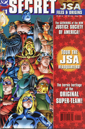
On the other hand, I am serenely proud of the work I poured into these pages. Did I go overboard—I sure did. But this is a working headquarters of a super team. How do you do less, when all you’re given is two, three pages. I was not given a series of stories in which to show things organically. There’s a museum and a gift shop, of all things (Mr. Goyer’s idea, by the way). Dining halls, conference rooms, sleeping quarters, big computers, gym space, underground parking for cars and helicopters – including an elevator that runs the chopper up through the building and allows it to take off through roof hatches, seismic-resistant rail links to other bases or the NYC Subway, escape tunnels as part of the sewer system (I love a good sewer!)… I really tried. It appeared in JSA Secret Files and Origins #1, August, 1999.
Technically, this HQ was the third version for that institution. (And–ehhh—ahah–there’s apparently now a fourth version. Which means they blew this one up! Ah well, sic transit Gloria, whoever she is.)
Well… Mike Carlin put it best when he told me, “You don’t know when to stop.” He’s got a point.
Work, text and characters that are copyrighted © by others are posted here as my portfolio — as examples of my work. No infringement is intended and no one but the copyright holder may download images on this page or reproduce them in any way without the permission of the copyright holder.
Do not copy. Do not use.
DON’T STOP!!! … at least with these memoirs! Thanks! Great work, great creative processes! Great explanations!