The Story Behind the Guardians of the Galaxy's
Icarus Spaceship Schematic
|
|

For the first time!
Read the technical specifications and descriptions OMITTED from the 1994 Guardians of the Galaxy Annual No. 4
Page 1 of 2
I never had a great affinity for the Guardians of the Galaxy. Yet another space-faring group of super-heroes running around and doing stuff. There’s anger, yelling, hinted-at romance, doing battle, avoiding battle, etc., etc.
I think I zoned out of space-faring super-heroes when Chris Claremont had the X-Men hook up with the Shi-Ar . . . Then Bill Mantlo took a hand-axe to old pirate stories with his Swords of the Swashbucklers. By then I was propping my eyes open with toothpicks. Whoo boy.
But when Marvel Comics editor, Craig Anderson called for me to do the Guardians of the Galaxy's big ole spaceship, Icarus, I said, “You betcha!” You see, 1994 was a dark year for this comic book professional. The comic book biz was sinking and no one knew why. (If you want a better idea, read
Comic Wars by Dan Raviv
Hardcover: 320 pages, ISBN 0-7679-0830-9. This is a terrific account of much of what went wrong. Us poor bums doing the work had very little idea so much was going sour around us.
I started by learning about the good ship Icarus. I was put in touch with the very nice comic book creator, Kevin West, and we yakked up a storm. I got what I needed from him and then I was put in touch with Michael Gallagher, another very accommodating comic book creator. Between these two guys, I had little to do in terms of searching for reference! They very kindly sent me their concept ideas and sketches and some good reference from the books. When you need to know something about a comic book the pencilers are the guys to seek. They have to know even more than the writer, as it is they who add the visual twists that place the story in “a” reality for the reader/viewer.
So, why am I writing about this middle-of-the-road team and their spaceship?
Because each of my complicated “tech” pages is a home run for me. An over-the-horizon, air-traffic-controller-alert home run. Each ship, each headquarters page, is a stand-alone beast of varying complexity which takes days of design and penciling and then days or weeks of inking and finishing and writing.
|
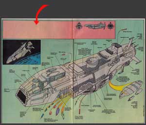
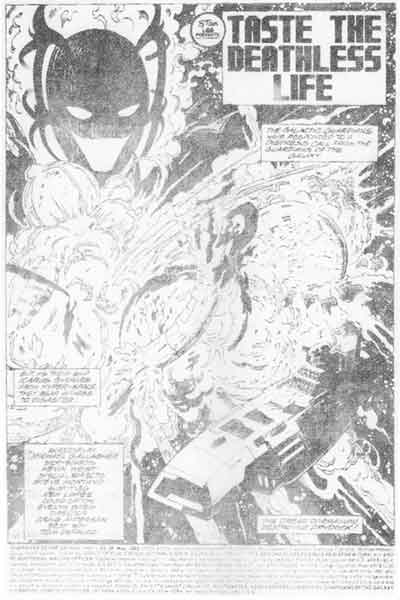
And because the Guardians of the Galaxy 1994 Annual No. 4 is the only comic book that contains a work of mine that was printed in a severely compromised fashion.
Now there is enough of the “call out” labeling done, so that readers may not have expected any more. But there is that gaping, yawning acre of empty space that tells a different story.
But before this perfidy occurred, Kevin, Mike and I were gamboling happily along. See below? Happy and unsuspecting . . .
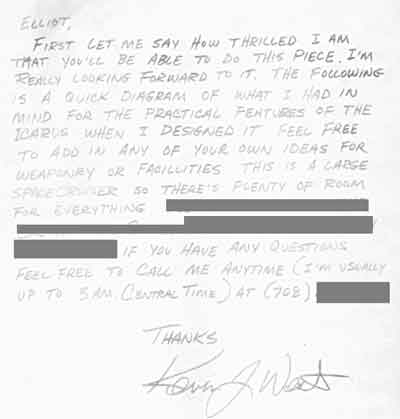
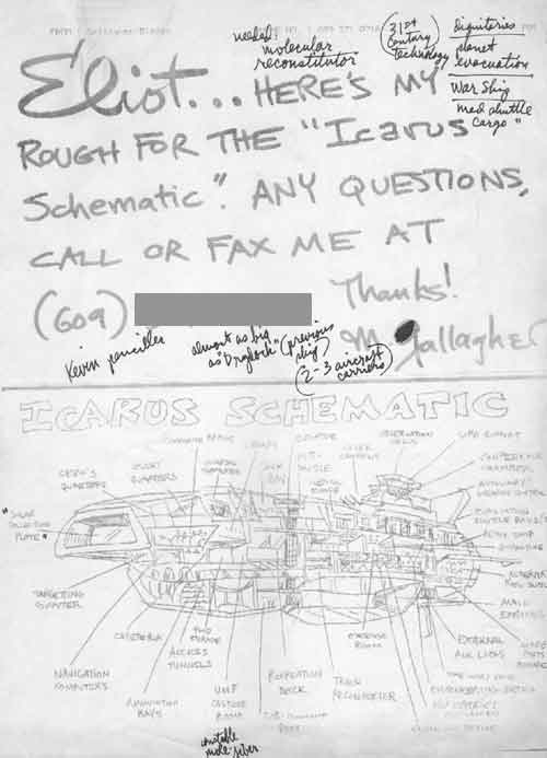
Kevin West wrote, “First let me say how thrilled I am that you'll be able to do this piece. I'm really looking forward to it. The following is a quick diagram of what I had in mind for the practical features of the Icarus when I designed it. Feel free to add any of your own ideas for weaponry or facilities. This is a large spacecruiser so there's plenty of room for everything.” Kevin, who was as gracious as one could hope for, provided me with as much time as was needed to get all the details right. Michael Gallagher also started me off with reference and sketches.
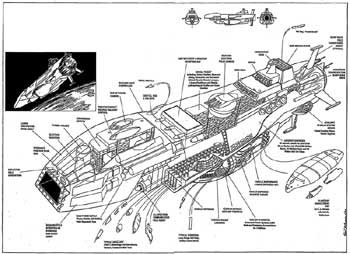
Great Ceres, indeed! So there’s a good look at the Icarus.
The above sketch of the Icarus, the Guardians of the Galaxy Spaceship, came from Michael Gallagher. I found this angle was not sufficient to allow one to see far enough “into” the ship. With a ship as large as this, scale and what you could reasonably expect to see plays a big role in how lazy I can be. The more you can show, the more details you have to draw. When you can get down to seeing door-knobs, for example, you have to draw thresholds, hinges, door mats — well, you get the idea.
The splash page above is the Guardian of the Galaxy's old ship, Drydock, getting turned into space dust. This is from Guardians of the Galaxy Vol 1 No. 26, May 1993. A nice reference picture.
The sketch below of the Icarus, the Guardians of the Galaxy Spaceship, is from Kevin West, showing slightly better proportions. I liked a leaner ship. Sure, we all know that spaceships can look like flying office buildings, but it’s harder to hear them go “whoosh” that way. The pointy end goes thataway.
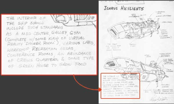
Kevin West wrote, “The interior of the ship should include such standards as a med center, galley, gym (complete w/some kind of “virtual reality” danger room), various labs, workshop, recreation areas, conference rooms, an abundance of crew quarters & some type of green house to grow food.”
|
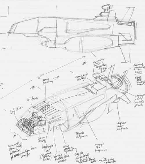
At right is my first sketch of the Icarus, the Guardians of the Galaxy Spaceship. This was the angle I liked and stuck with. I had heard a little bit about Prof. Bussard’s ram scoop concept. Of course, I had read all about it in early
But the idea that gigantic magnetic fields could be set up in a fan-shaped scoop pattern to guide in hydrogen atoms — located liberally throughout inter‑stellar space — and shove them into a fusion reactor to generate electricity was a totally real one. Who knows? They may happen some distant day. In the meantime, I had to switch the techno-babble generator to “overload” for this ship.
One thing I'd like to point out are those skinny, antennae-like masts sticking off the back end. There’s something about the Japanese and these things. There was a pretty cool Japanese anime movie that started a whole lot of space hardware on its way. But they had these kooky mast things sticking off them. What did they do? For me, it was what could they do! (They could put your eye out!) So you may note that my comrades-in-art shied away from explaining these things. But me? I waded in and labeled them, uhh, several things. I eventually settled on “Warp Wave Field Conditioner.” Yep, that’s right.
1994, the year this work was rendered and printed, was not long enough after for people to completely forget it. The look of the Icarus was clearly influenced by the shape of the Battlestar Galactica. The look of Galactica was okay — not bad for 1978! Now a lot of people hold that show up as a high water mark of sci-fi brilliance. But it was producer Glen Larsen capitalizing on Star Wars and demonstrating how “economical” TV could be with using footage over and over again.
Usually I am stuck with whatever oddball shape the comic book creators — to be fair — either spat out or labored mightily over. When I got to do something on my own, like with this piece, I could have some fun. I figured there would be a variety of shapes and in that way, perhaps a variety of ways to suggest that they were designed by engineers of different world races. I thought it would be fun to show just how big this thing was by showing how many other ships it carried. I finally got to design something for myself.
Then came the writing part. I was particularly proud of the serious foundations I had laid down. The highest high-technology I could come up with — this was in the days before “nanotechnology” was a part of everybody’s toothpaste! The entire hull was made out of carbon-60, which was brand new (as a discovery) back then. No one knew that it couldn't be made into a super hull! I was really hoping to introduce new ideas to the series, suggest potential for the writers . . . Let’s just say I worked really hard on the copy.